The Colors That Surround Us
Color affects our life more than we give it credit for. You may have noticed that some colors make you feel a certain way. For example, a bright color may make you feel cheerful, while a color with a darker hue can be more calm and soothing. This is why, for centuries, color has been used as a tool: to express, to influence and to attract.
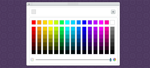
If you’re starting out your site, regardless if it’s with a Website Builder, Dreamweaver or Notepad++ you need to put some serious thought on the color scheme you’re going to use. And even though color perception depends on a lot of things, like culture and mood, here we’ll give you some guidelines to help you start coloring your site.
Say What You Want to Say With the Right Use of Color
People will judge your site in a quick glance. That’s why it is very important to attract your audience within seconds of them visiting your site. Color can be a big help to make your site visible because you can reflect the site’s intent with it.
To illustrate what was mentioned above, let’s say you have a site that’s aimed at a younger audience. With it you’ll be able to combine pinks, greens and yellows so they catch and amuse the visitor’s eye. On the other hand, if your site’s more formal, integrate a “quieter” color palette, that puts focus in content. Now imagine if it was the other way around: a kid’s page with really sober colors and a business site with a loud and distracting color scheme. Doesn’t add up, does it? That’s why choosing color is more than just aesthetics.
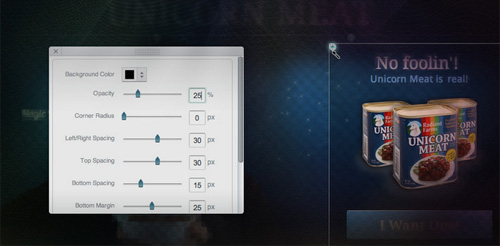
Here’s a good example of color done right. The image below shows the homepage of designer-oriented website builder, Breezi. Notice the cool palette they use: even though they’re dark, they have little hints of color that gives it a visually interesting effect while it makes the site seem like a welcoming and creative environment.
The bottom line is that you need to express what your site’s about through color.
Start the Coloring Process (No Crayons Required)
It can be fairly confusing to be certain of what colors “feel right” with your site, especially if you’re a beginner in web design. Nonetheless, you can’t let this opportunity go to waste: think about your project, its intent, the visibility you want to achieve and your audience and use this information to create your palette.
Don’t be discouraged: no matter what your site’s about, there’ll be a color theme for it. To achieve this you can take some references from other websites that are similar to yours.
Another way to start coloring is to think about your site and associate colors to it. Is it a site about music? If it’s about country singers, you may want to use earthy tones because they resemble cowboys and a natural palette would go best with it. If it’s for djs, you may want to go on the opposite direction: bright colors that you wouldn’t find in nature because that kind of music mirrors technology. Some may be easier to do because they are socially reproduced: a Halloween-themed page will look good with black, purple, orange and green.
Are you working based on an existing palette? For example, if you’re creating a site for an established business that has a color scheme on itself, you’re job becomes increasingly easier.
Or maybe you have a type of style you want to take on. A minimal website needs pure and clean colors while a site with a kitsch design needs to go the other way entirely.
Leverage Your Use of Color to Make an Impact
No matter what you choose, there are some things you need to consider:
If you come up with a color palette, stick to it. Color is a great way to keep your design cohesive and make all the pages in your site seem like they belong together. If you want a certain color for your headers, make sure all your site’s headers are the same hue. After all, a combination of colors can express something specific and if you’ve already found a color palette that goes perfectly with your site, why not use it?
Be considerate of your content. Color can be of great visual assistance to your site, but it’s just that: a secondary character. More often than not, you’ll need to choose content over design, so be careful not to make your color scheme take center stage. Don’t abuse it: using a lot of different colors can be distracting from your site’s content. Keep it simple and cohesive.

On that same note, be careful with bright and obnoxious colors. We recommend not using them on a major level: like texts and backgrounds. For these, we suggest going for hues or patterns that will let the visitor calmly read and look at the content in your site.
BUT don’t forget to add some accent pieces. You can use a vibrant color for links, buttons and important phrases. Just be careful: if you make everything stand out, nothing will.
Take a Colorful Note!
As we mentioned before, a great way to figure out what to do with color, is to look at other sites. Here we’ll give you some examples of sites that use color perfectly to convey their purposes.
This first one is a site about a black and white photography studio. The use of color here transmits just that. Obviously the design and typography come into play, but by just looking at the pattern and color used in the background and the color of the text, you can imagine what that site’s about.

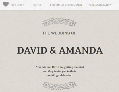
This second one is a site for David & Amanda’s wedding. The colors reflect a sophisticated and pure ambiance: everything a wedding should be. The pattern gives the site a paper-like texture.
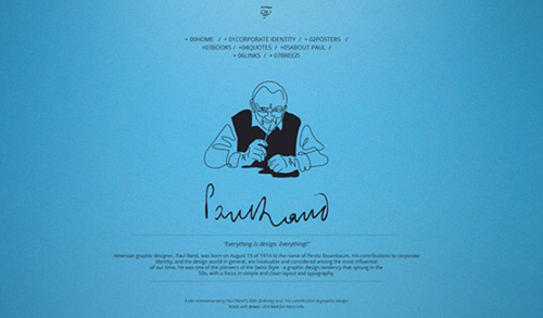
The last one is a tribute to minimalist designer Paul Rand and the color is just that: minimalistic. It doesn’t use a pattern or a second color. Also, this color is one that was present in some of the designer’s work.
A Colorful Commentary
Remember, coloring your site can be a long process but the outcome can be very powerful. Know what you’re site’s about because that will be the starting point for selecting a color palette for it. After that, you’ll just need to take into mind the tips we stated in this article and there’ll be no stopping you. Have a colorful site creating process!



I agree that colors dictate how people perceive things. That’s why important is color in almost any graphic design project. You have to really think it through up to the very last detail. Of course, you also have to consider your market and the type of business you’re running.
Maybe you can feature an article about the psychology of color next? That’d be a nice follow through about colors and how they affect your audience.